
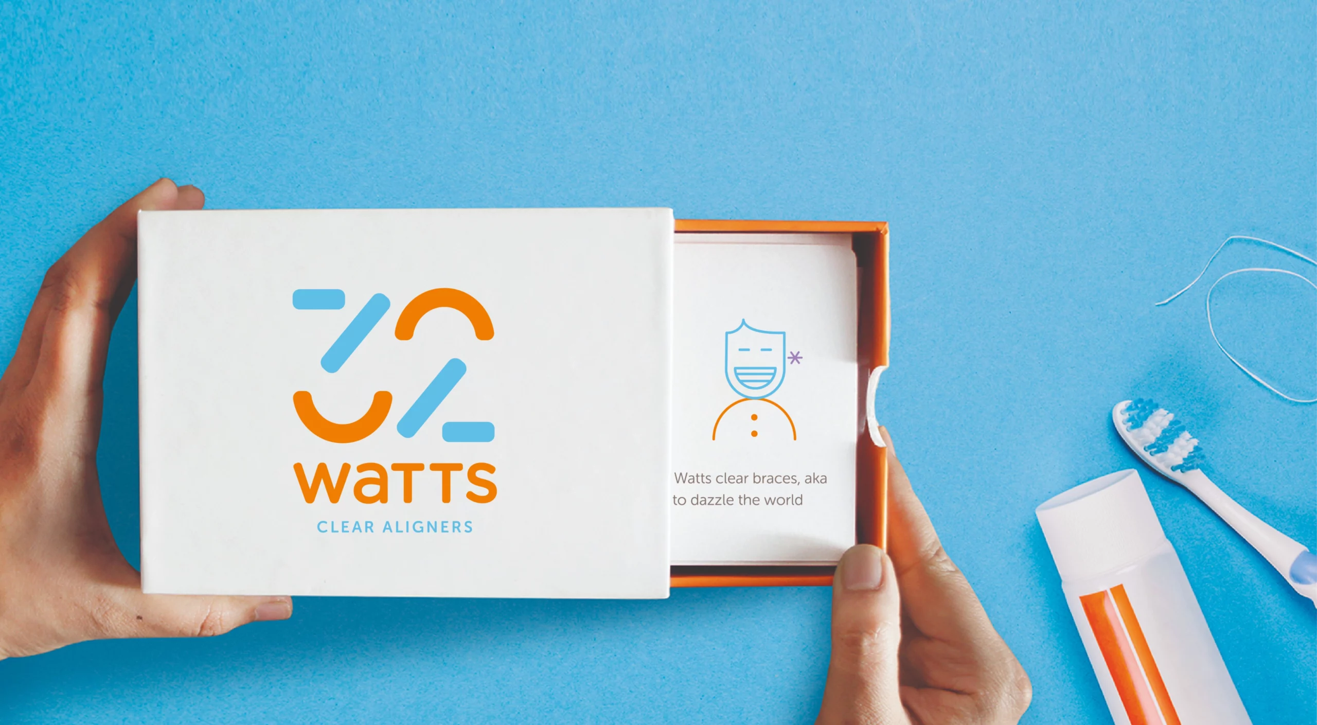
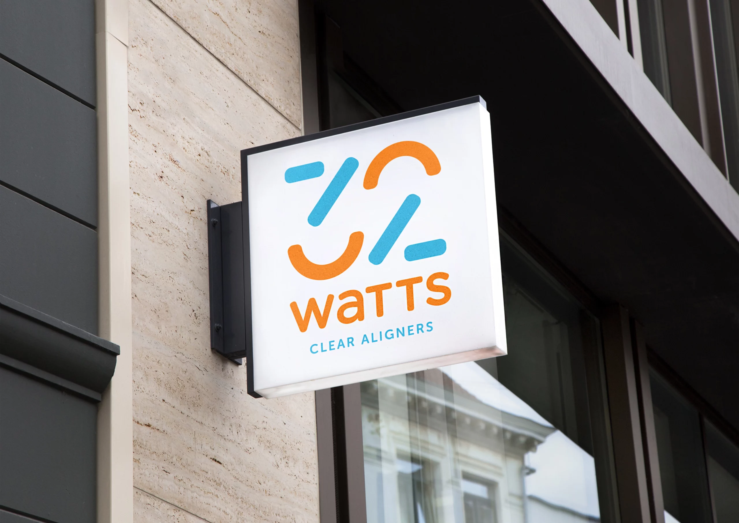
32 Watts
Illuminate Your Smile with Charm and Expertise
SECTOR
Healthcare
SERVICES
Positioning
|Narrative
|Visual Identity
|Visual Extensions
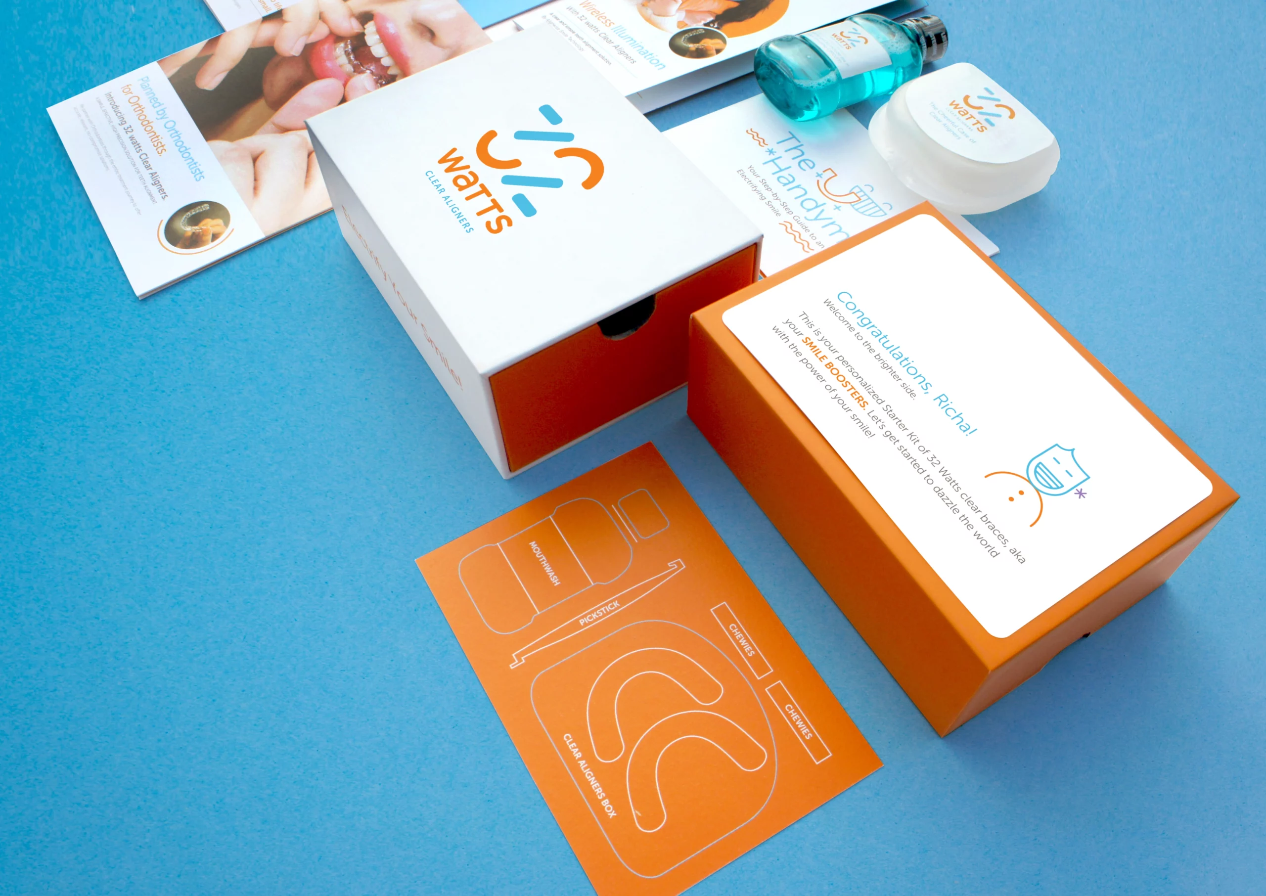
|Packaging
|Naming
Context
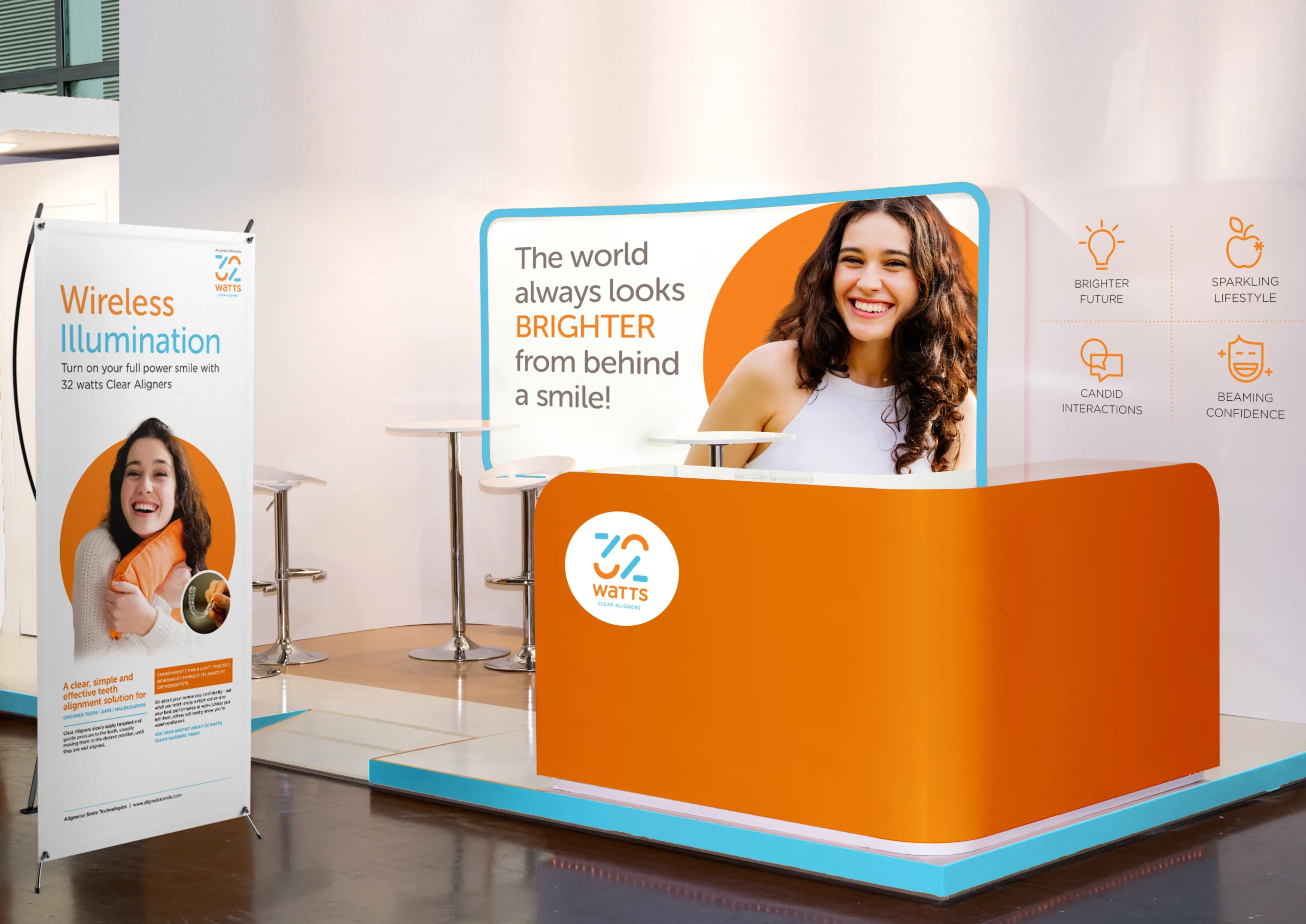
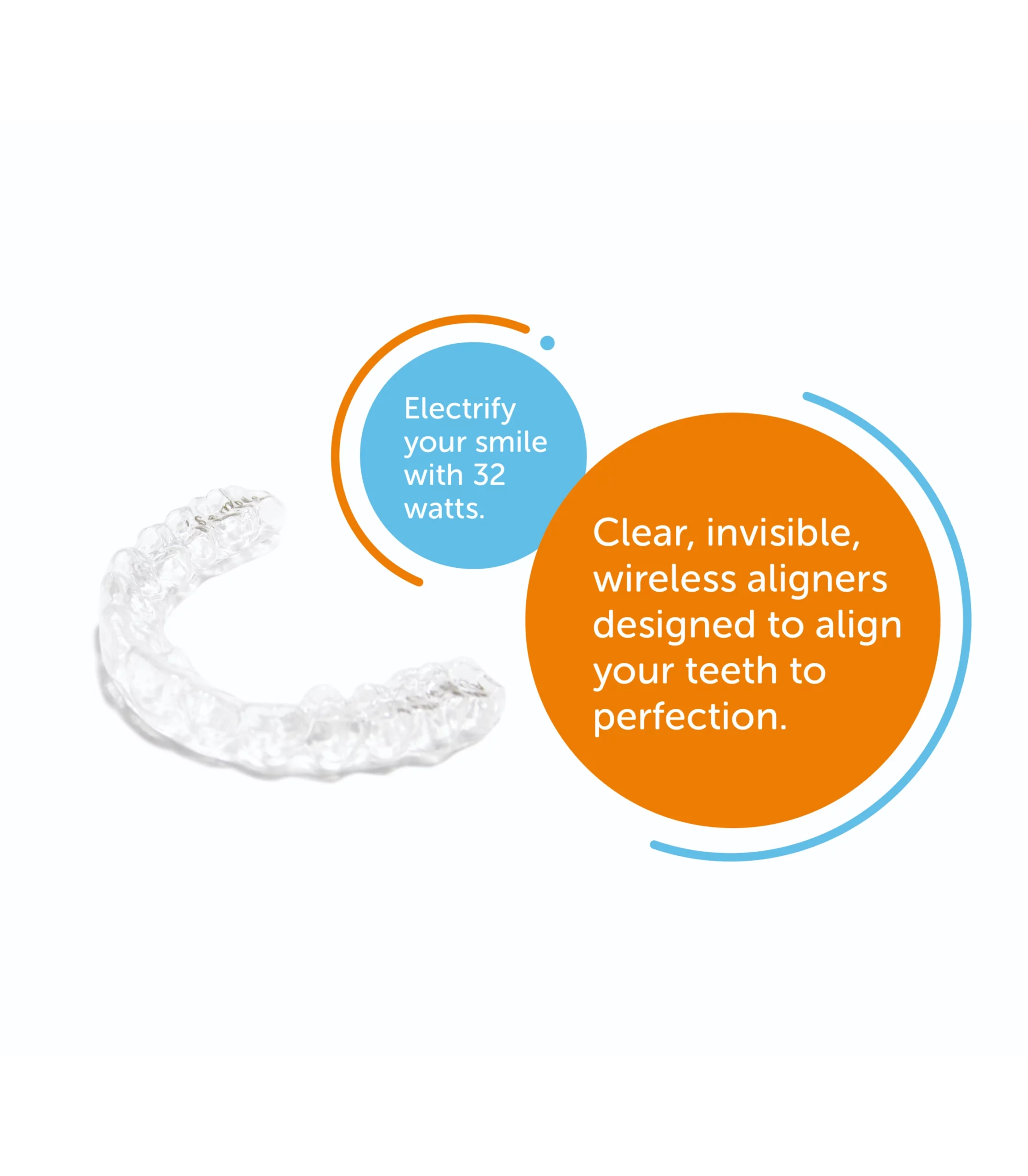
32 watts offers dental correction guided by experts and crafted by specialists who understand young aspirations. 32 watts is a home-grown gem that offers clear aligners for dental correction.
In a market where aligners are still finding their place, our client recognised the need to enter with a clear strategic identity and a design language that would set them apart. Beyond that, we wanted to infuse this category with a touch of charm, injecting a sense of fun into dental correction.
Our Approach
After conversations with many young men and women, we discovered the motivations behind teeth alignment and the barriers holding them back. With this knowledge and inspired by the vision of the founders, we positioned 32 watts as an accessible expert, a brand that brings a playful twist to dental correction.


TESTIMONIAL


We hired C&R at an early stage of the business launch where everything, including the name, was up for grabs. Both Ashutosh and Ruhi, helped align the ethos of the promoters, the vision, and the mission of company with strategic brand positioning. They provided us with an inspiring narrative for the brand and brought our vision alive through the magnetic essence, all the foundational elements and the name. The following aspects make working with C&R special. Market research-backed process and the depth with which the team understood the business before getting into brand development work. Matching the positioning with the ethos of the company and aligning it with business strategy. Bringing the brand alive through an excellent visual identity that will ensure long-term brand recall.


