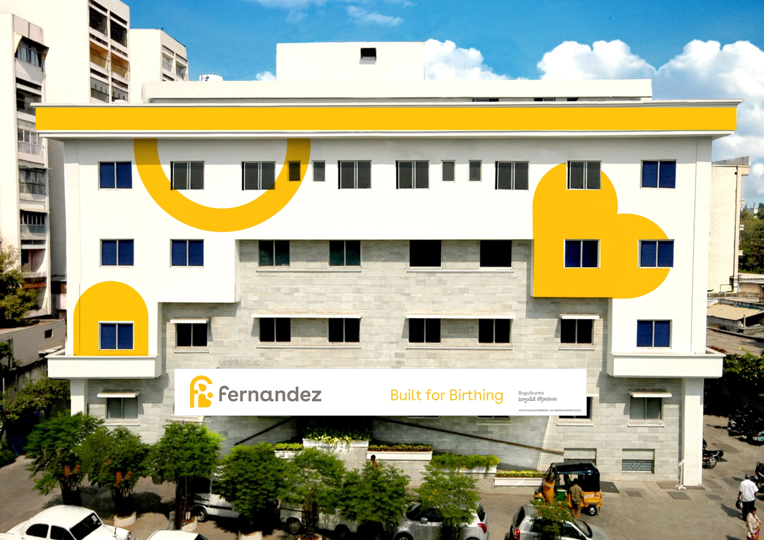
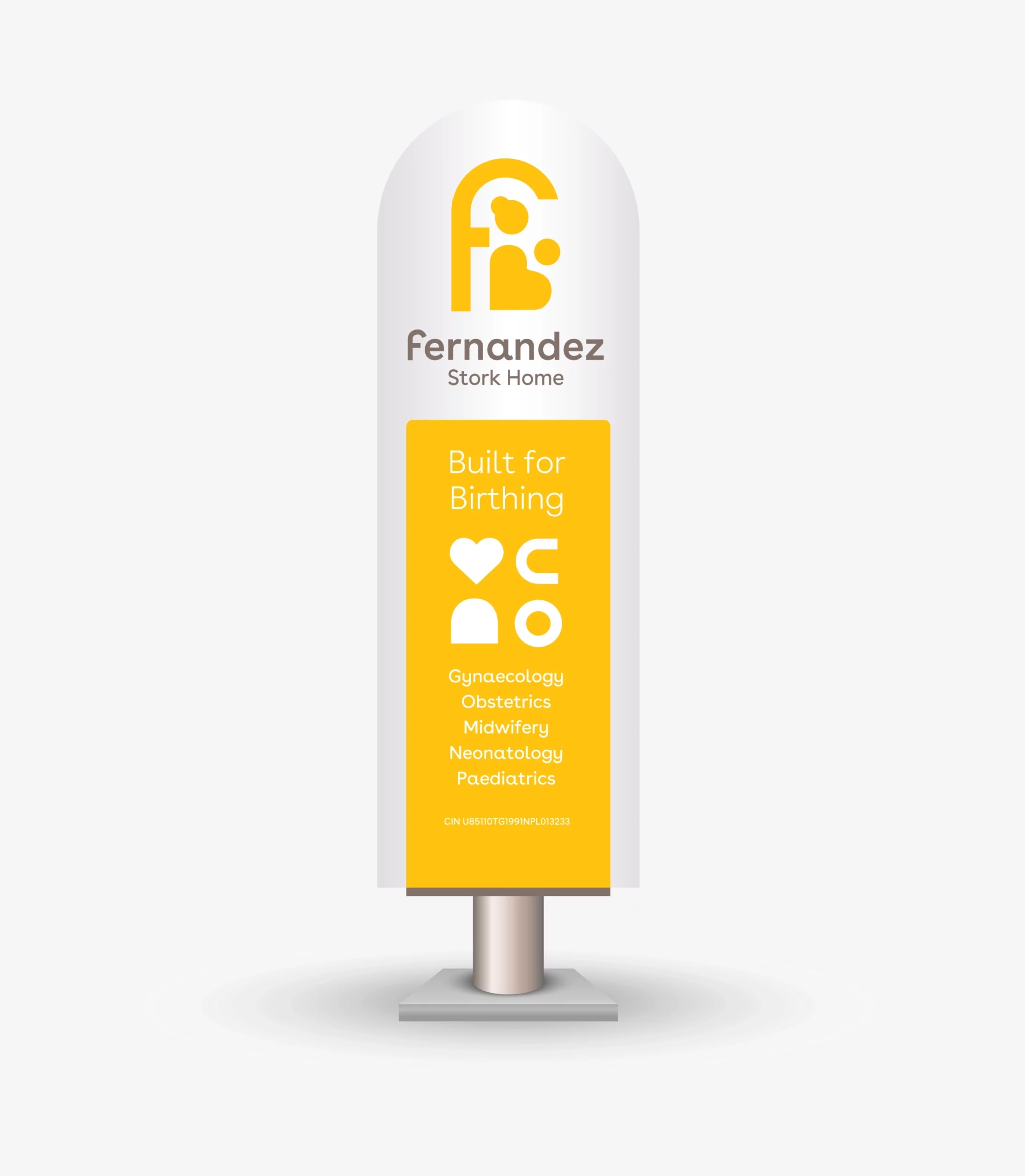
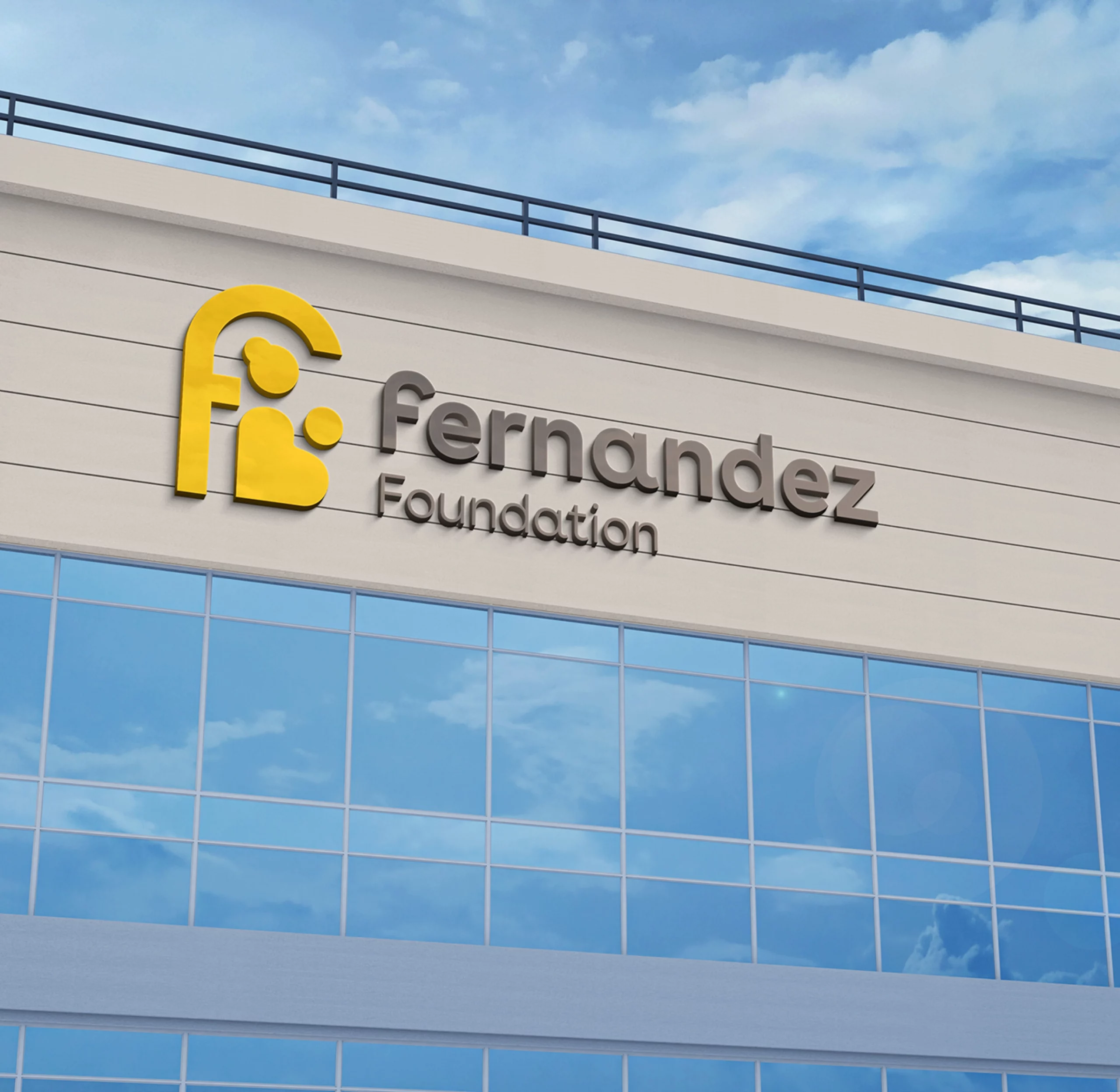
Fernandez Foundation

Advocating safe and joyful birthing
SECTOR
Social Sector
|Healthcare
SERVICES
Positioning
|Narrative
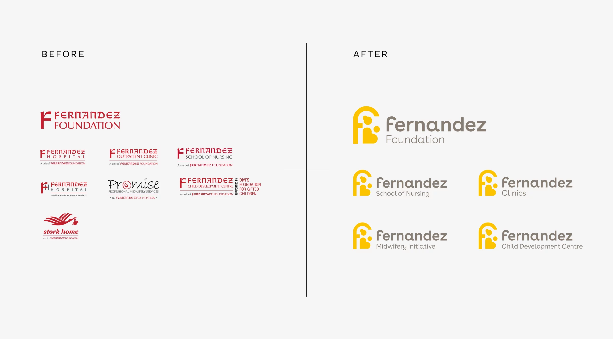
|Brand Architecture
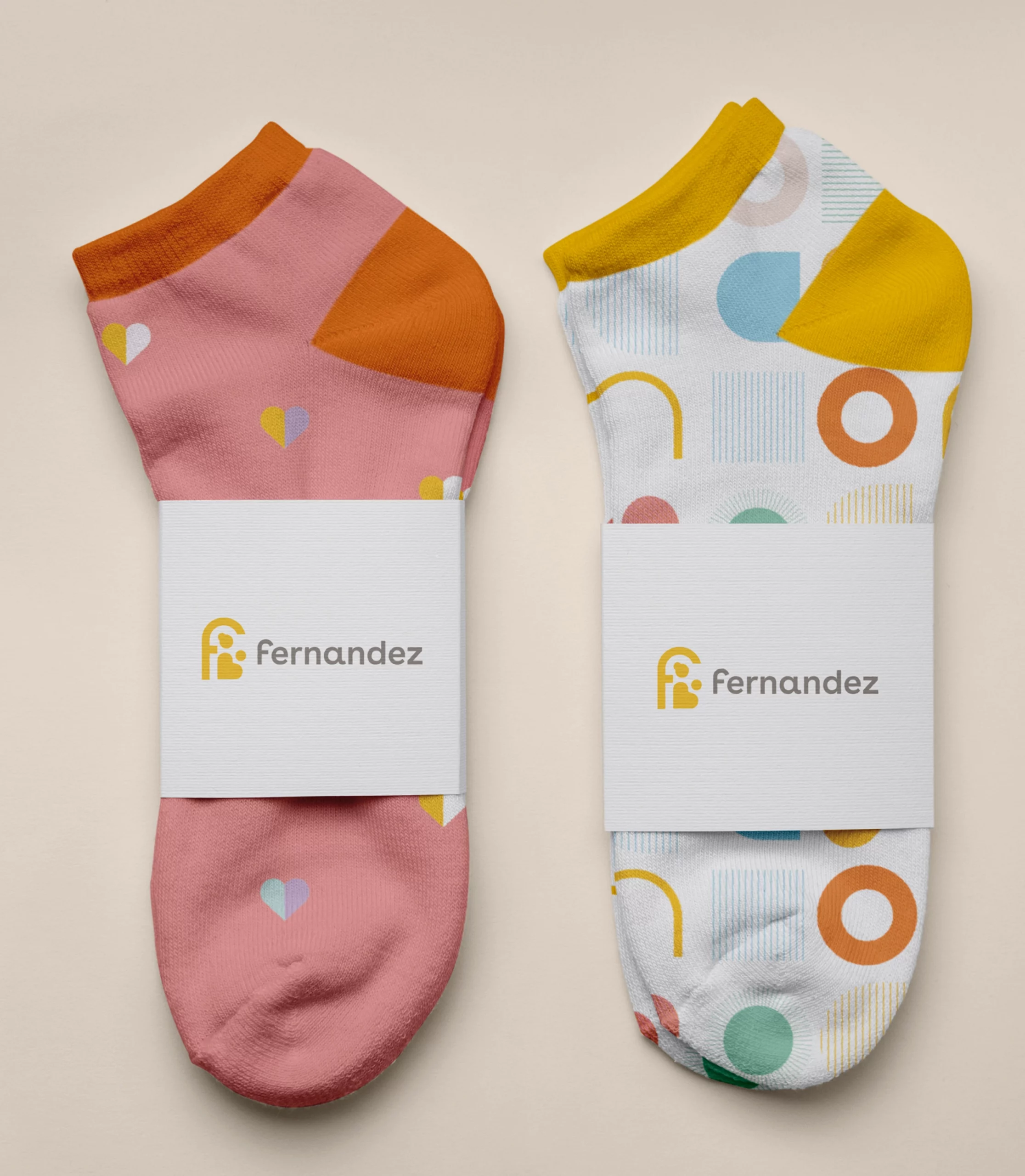
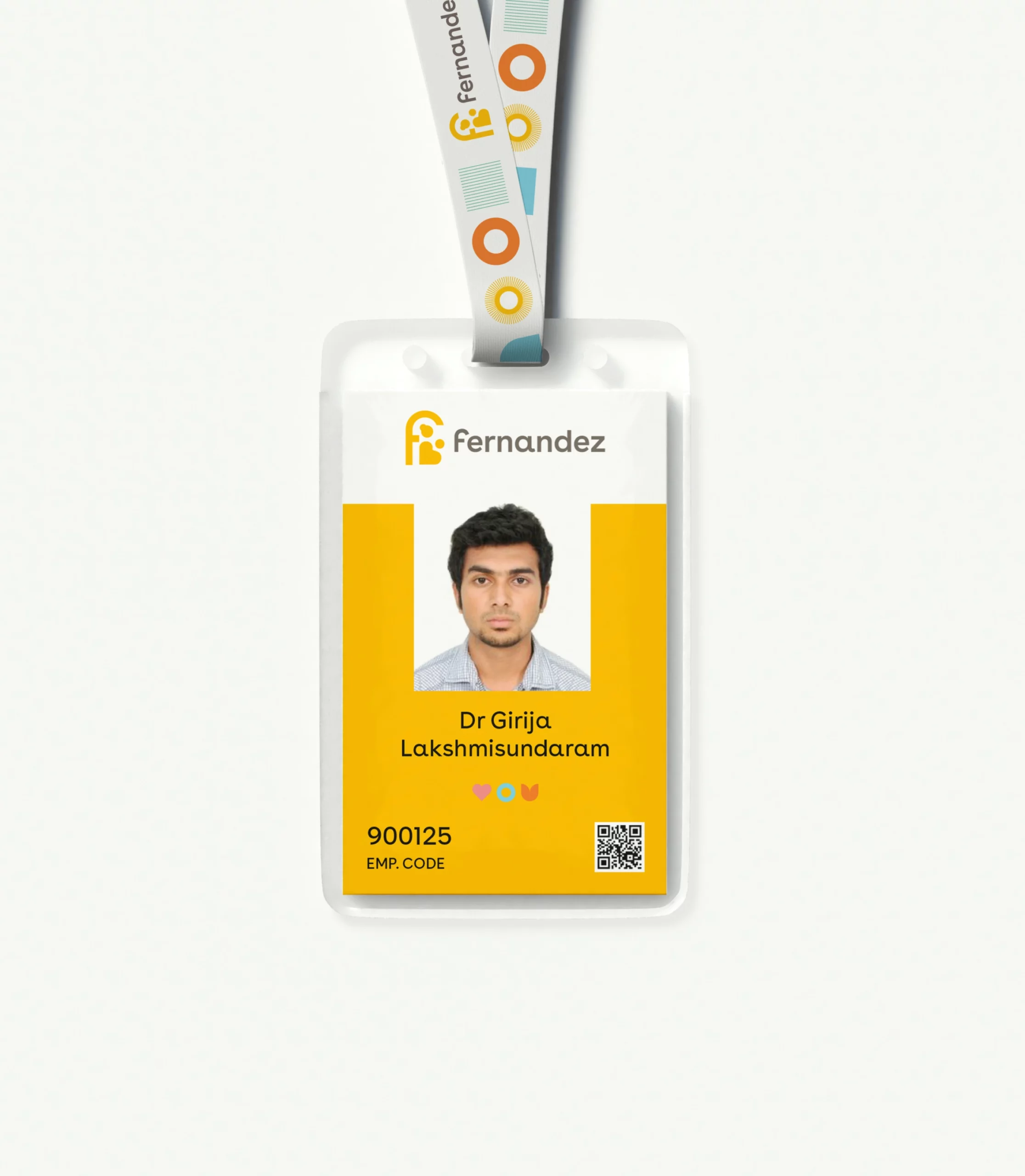
|Visual Identity
|Strategic Mantra
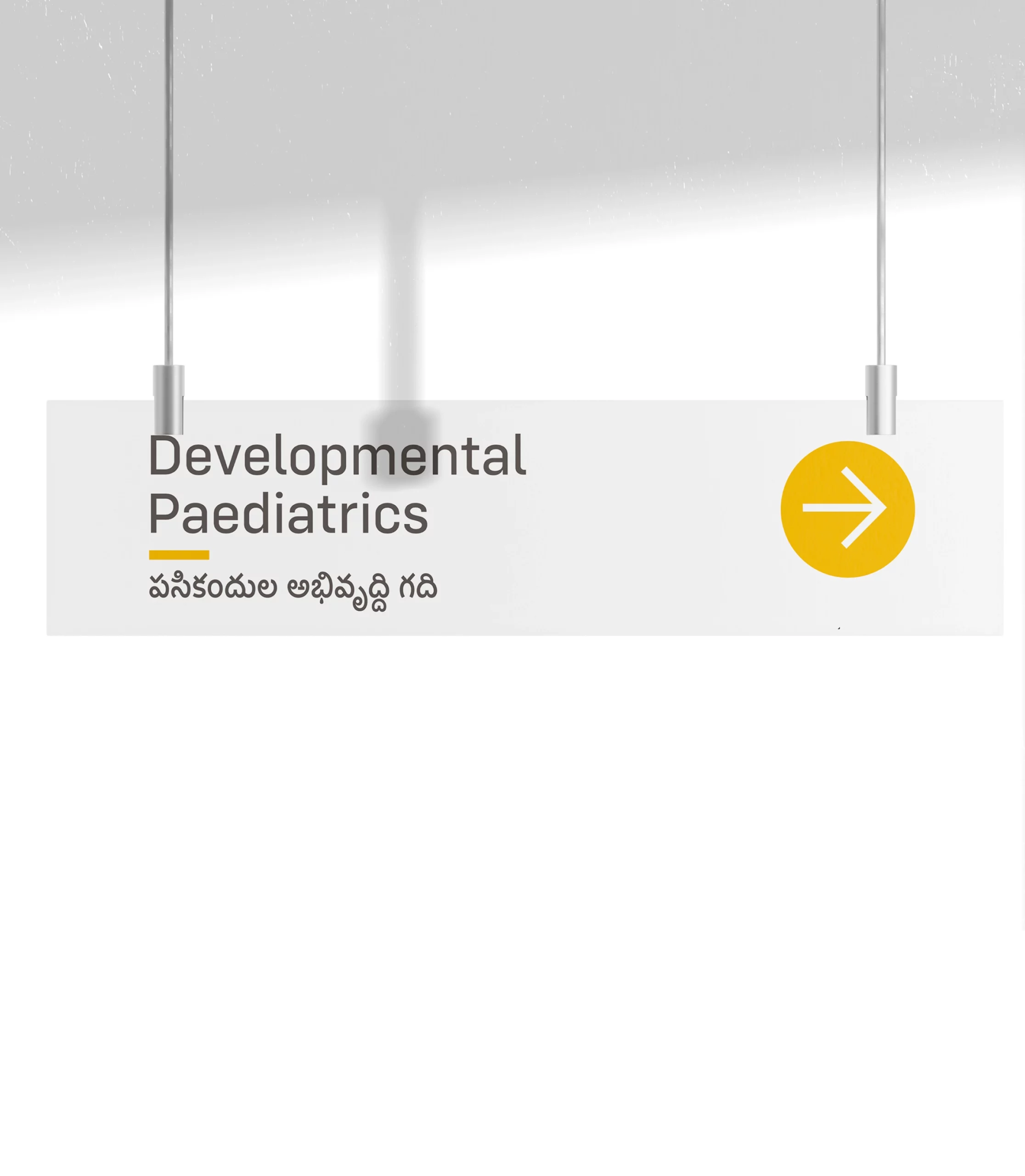
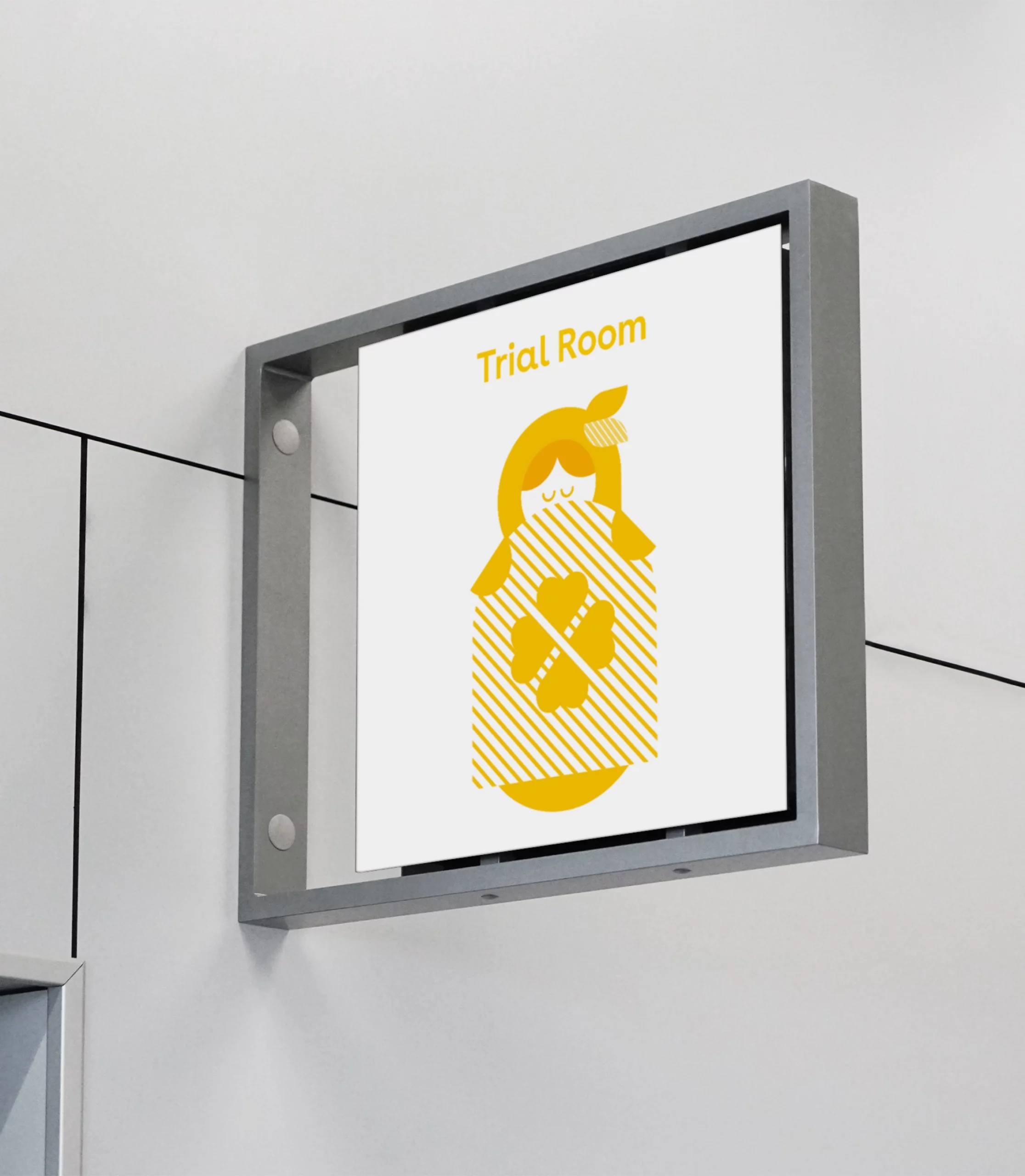
|Visual Language
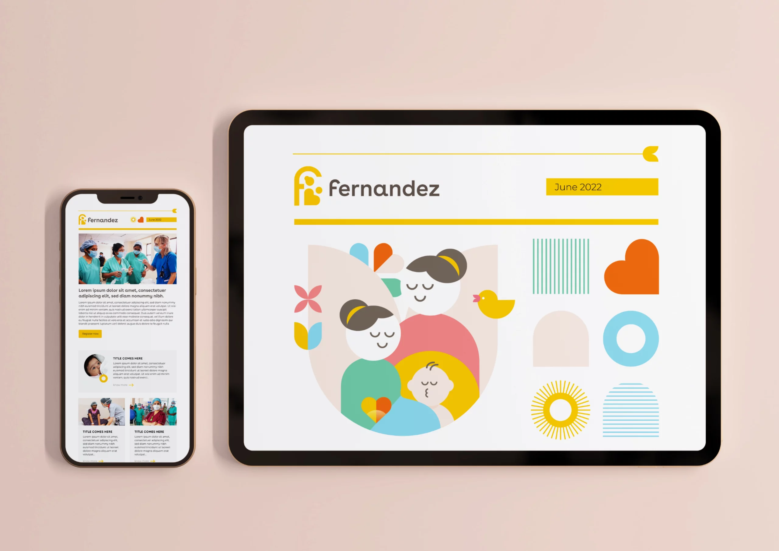
|Website
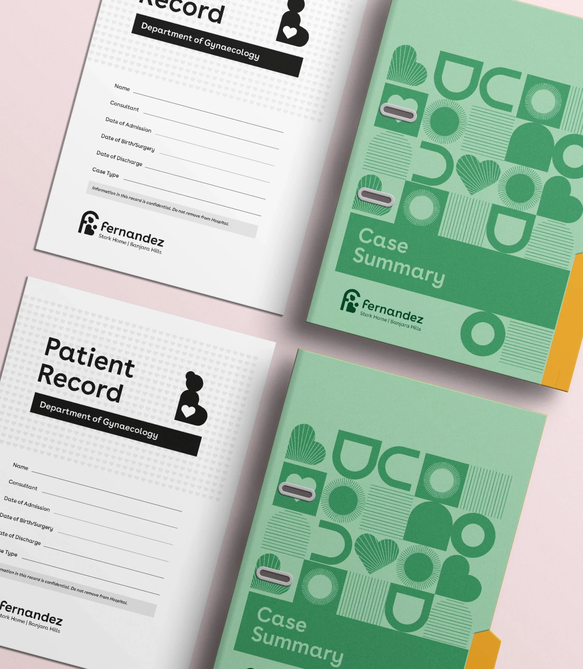
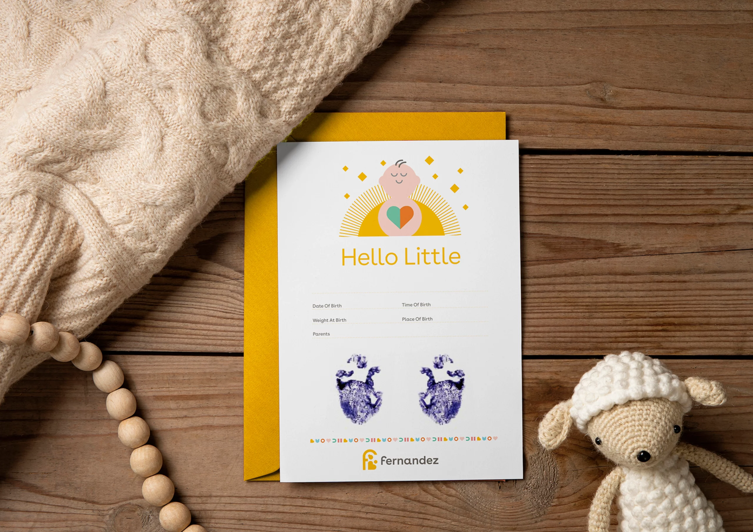
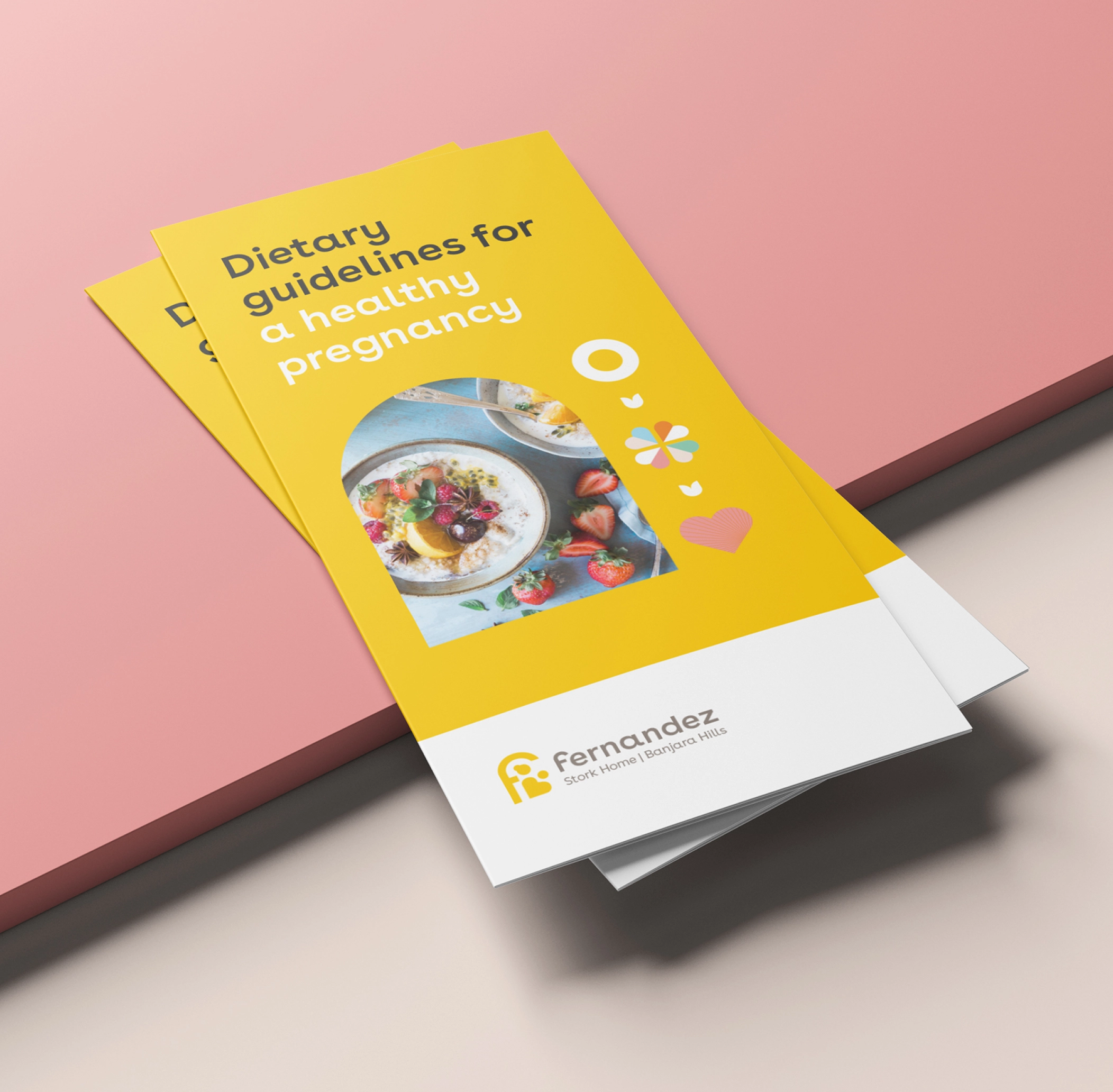
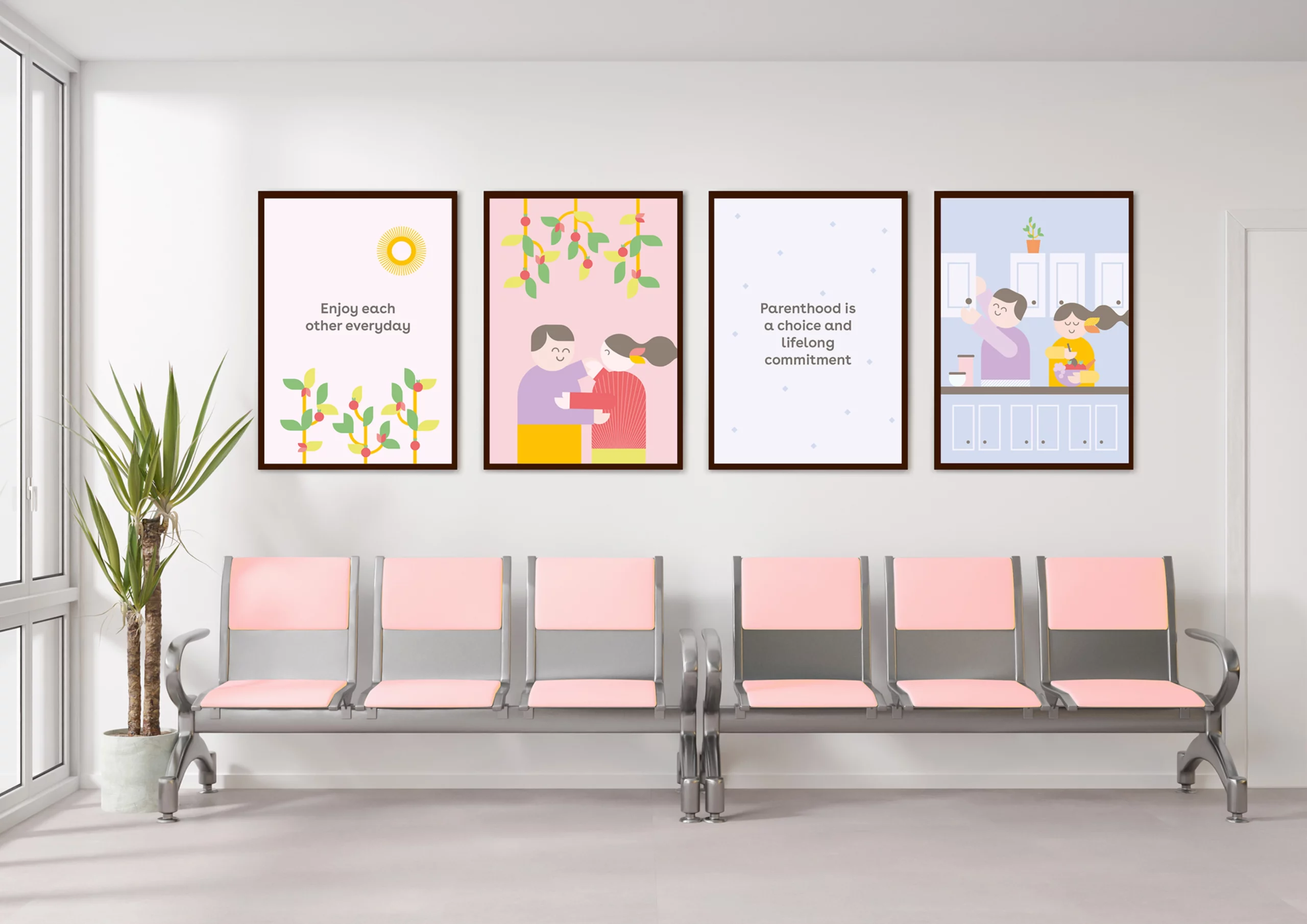
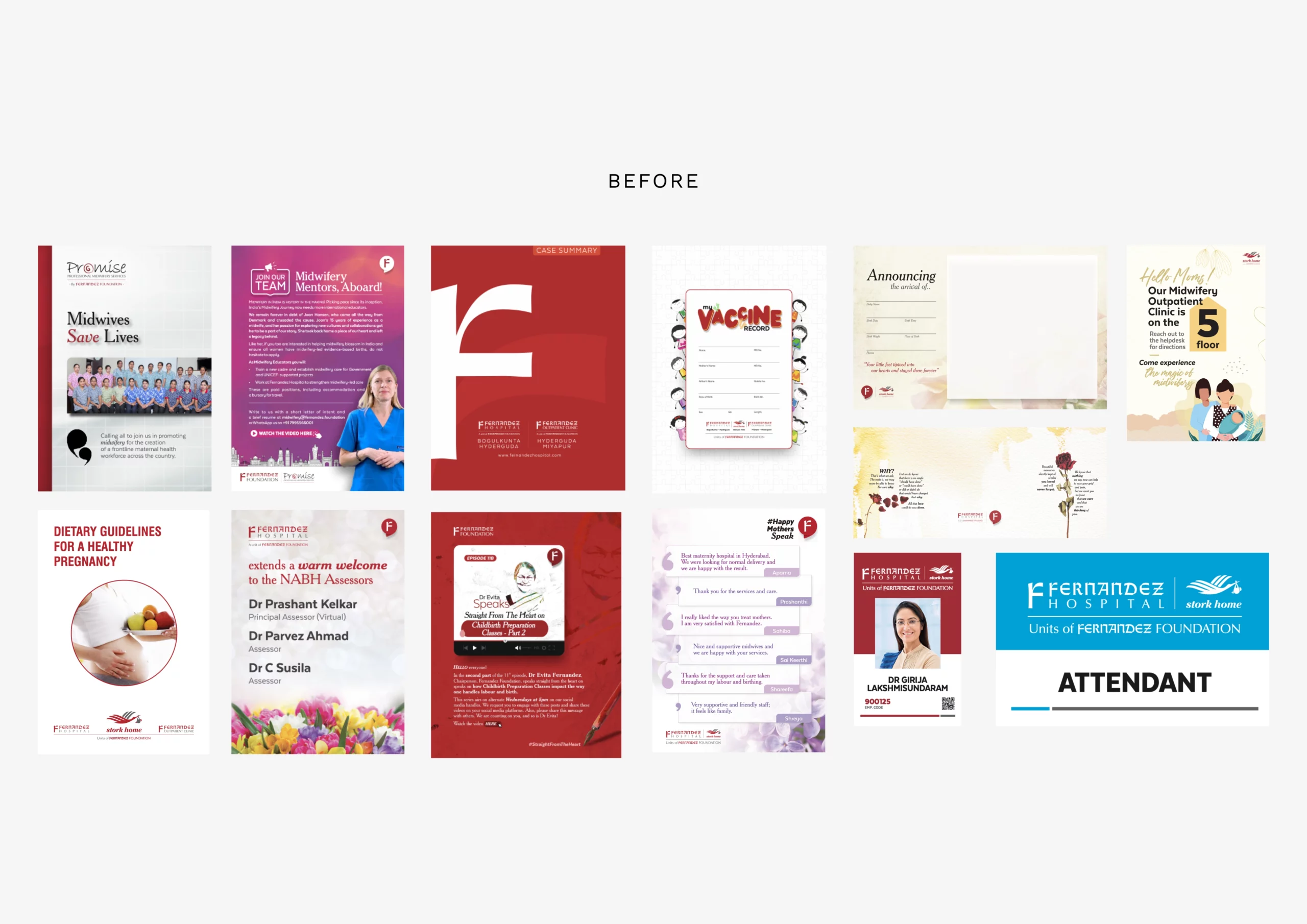
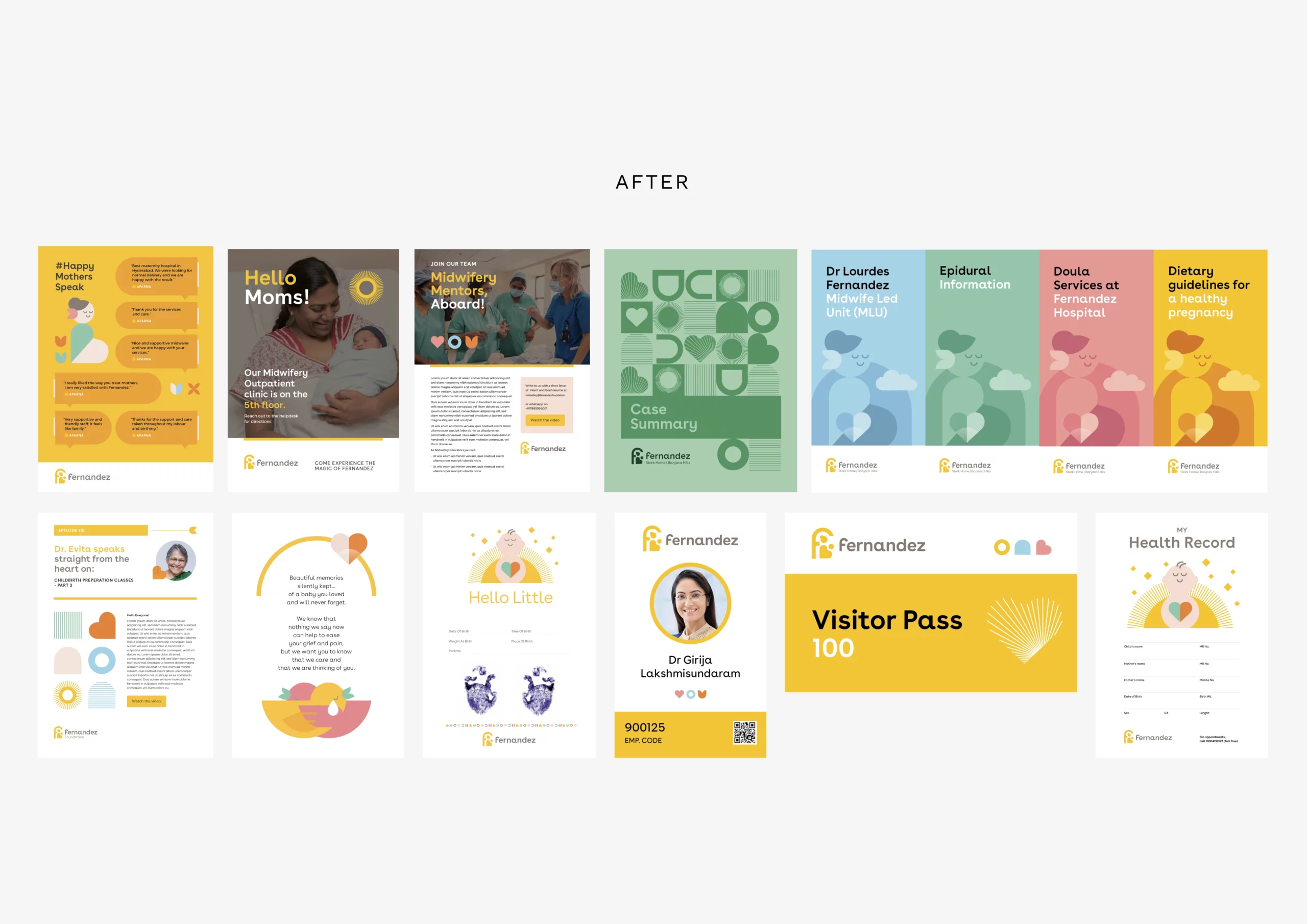
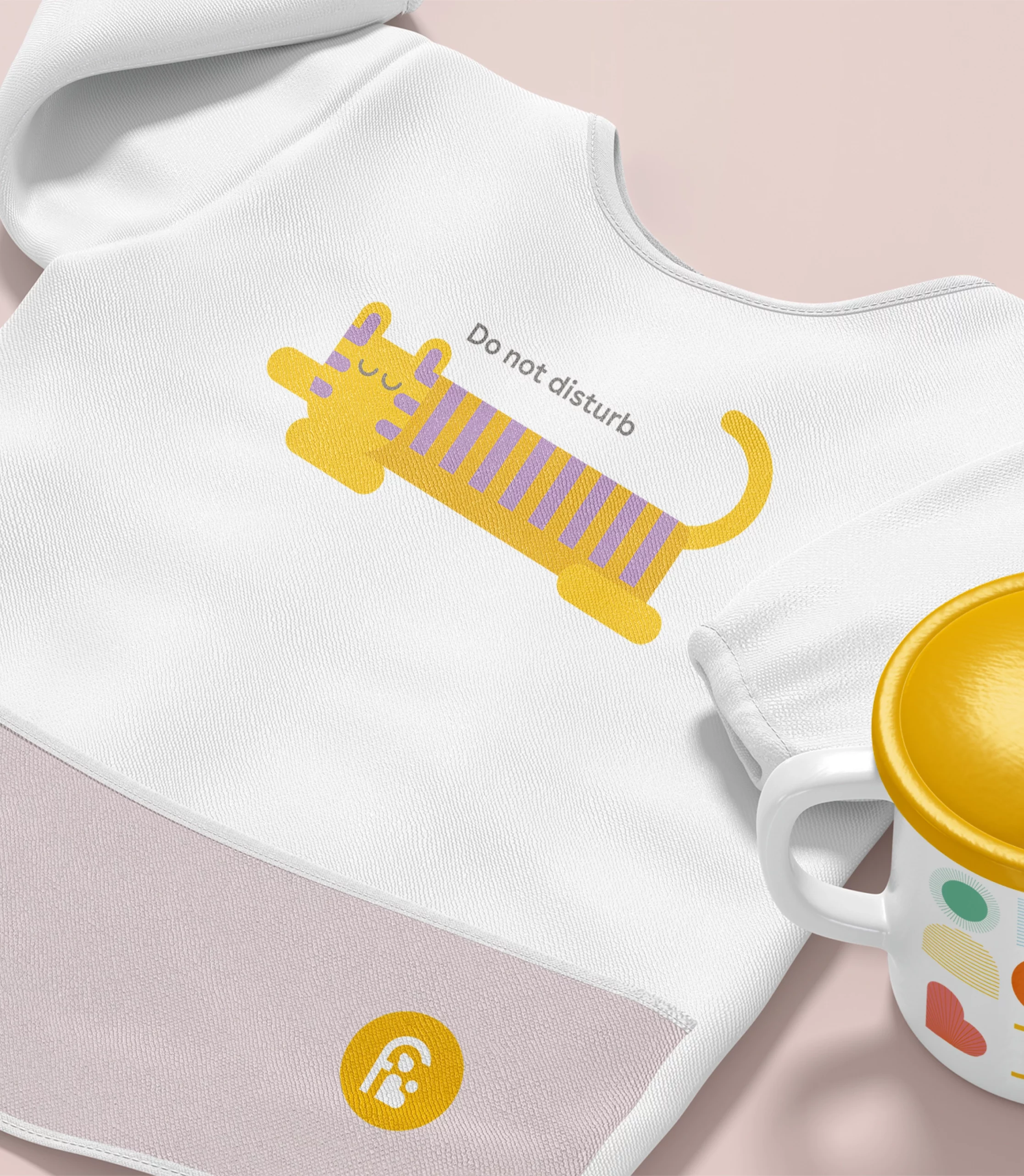
|Communication Material
|Brand Manual
Context
Fernandez, the largest and most esteemed chain of private maternity hospitals in India, approached us with a simple yet significant goal – to breathe new life into their website and express their recent transformation into a non-profit Foundation.
Our Approach
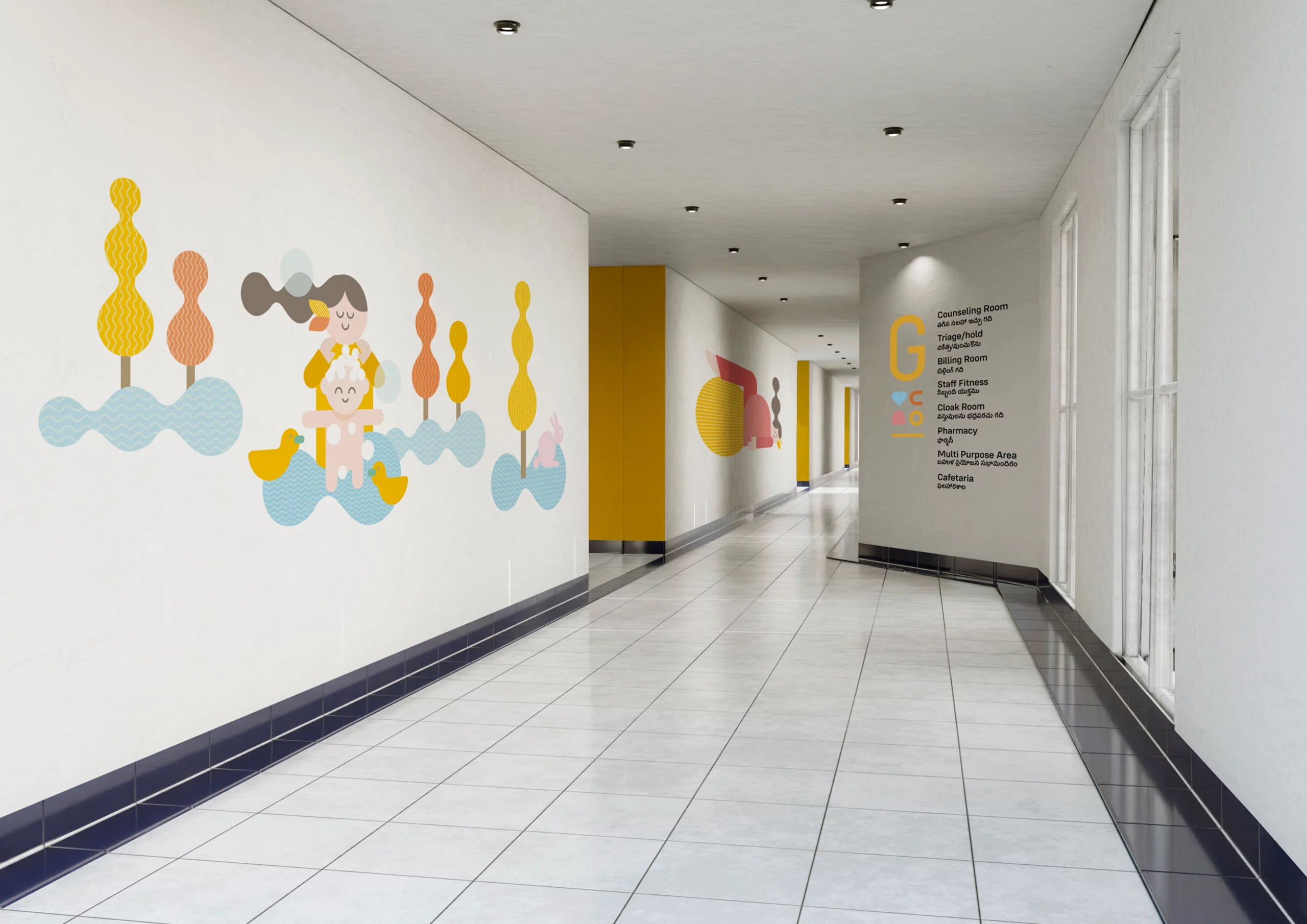
We embarked on this journey to uncover the hidden uniqueness of an institution with a remarkable 75-year legacy and over 200,000 births. What we discovered was more than just a hospital chain; we found a powerful ideology and a distinct point of view. Fernandez has been on a sacred mission to restore humanity and intimacy to childbirth, countering the prevailing trend of excessive medicalisation.


TESTIMONIAL


I was impressed with their approach to the task and their genuine desire to understand what Fernandez was truly all about. In searching for answers, Ashutosh and his incredible team led us on a journey of introspection and challenged us to think anew.
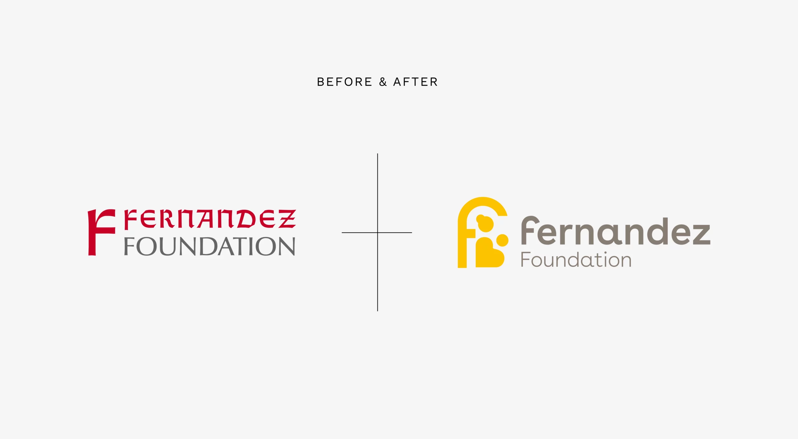
C&R scored an ace when they convinced us to change our logo- a decision that demanded “letting go” of the past and taking that leap of faith into the unknown!
The results were brilliant- the logo said it all and brought into sharper focus our commitment of 75 years to mother and newborn healthcare. The website brought in much-needed freshness and vibrancy.
I would recommend them to any organisation- big or small that wishes to tell its story, evaluate its focus and who are not afraid to hear the truth/be challenged.
You guys rock and you are the best!